Student Exhibition Production Guidelines from the David Brower Center
These guidelines are intended to help you and your students prepare and produce your own exhibition.
STUDENT ARTIST STATEMENTS
Writing an artist statement is an important part of displaying work in a gallery setting. The exhibition process can be an opportunity for students to practice and develop this skill.
Artist statements are highly personalizable and can take many different forms. Artist statements that are displayed as part of an exhibition can vary in format, content, and length depending on each gallery’s curatorial preferences. For the Brower Center’s Art/Act: Youth exhibitions, we request that artist statements be 2-3 sentences and explain how the work is connected to the exhibition’s theme. Students are also encouraged to discuss why their work/theme is important to them, and describe what they found interesting about the process of creating the work, or anything else they would like to share with viewers about their work.
See the below examples of artist statements from past Art/Act:Youth shows at the Brower Center.
Example 1: In this piece, I decided to represent the sheer amount of plastic that exists, and how it’s everywhere; in the Earth, and in us. The “claw” can be seen as humans force feeding plastic into the Earth and into ourselves.
Example 2: California state legislation has prioritized private agribusiness’s right to hold water over the public’s right to hold water since its conception. My piece highlights this inequitable resource distribution.
Example 3: I was inspired by an art piece of a preserved pelican with its stomach cut open and stuffed with plastic. In my art I wanted to capture how the consumption of plastic is eating these animals alive, swallowing them whole.
Artwork Labels
Each artwork should be accompanied by a label stating basic information about the piece. The exact information that is displayed can vary depending on curatorial preferences, but typically these will include the artist’s name, title of the work, artwork medium and often some background information about the piece. The formatting of the labels and the information that they contain should be standardized across each exhibition. Labels for Art/Act: Youth exhibitions at the Brower Center typically contain the following information:
- Artist’s name
- Artist’s grade
- Title of the artwork
- Media used to create the artwork in list format (Ex: Watercolor and acrylic on paper. Oil on canvas. Plastic bottle caps, stones, acrylic paint, and ceramic. etc)
- Artist statement: 2-3 sentences from each student about the significance, meaning of the work, the process of creating it. This is a chance for students to share what feels important to them about the artwork. If there is a theme to the exhibition, students may also address the connection between their artwork and the theme.
Layout and Installation Tips
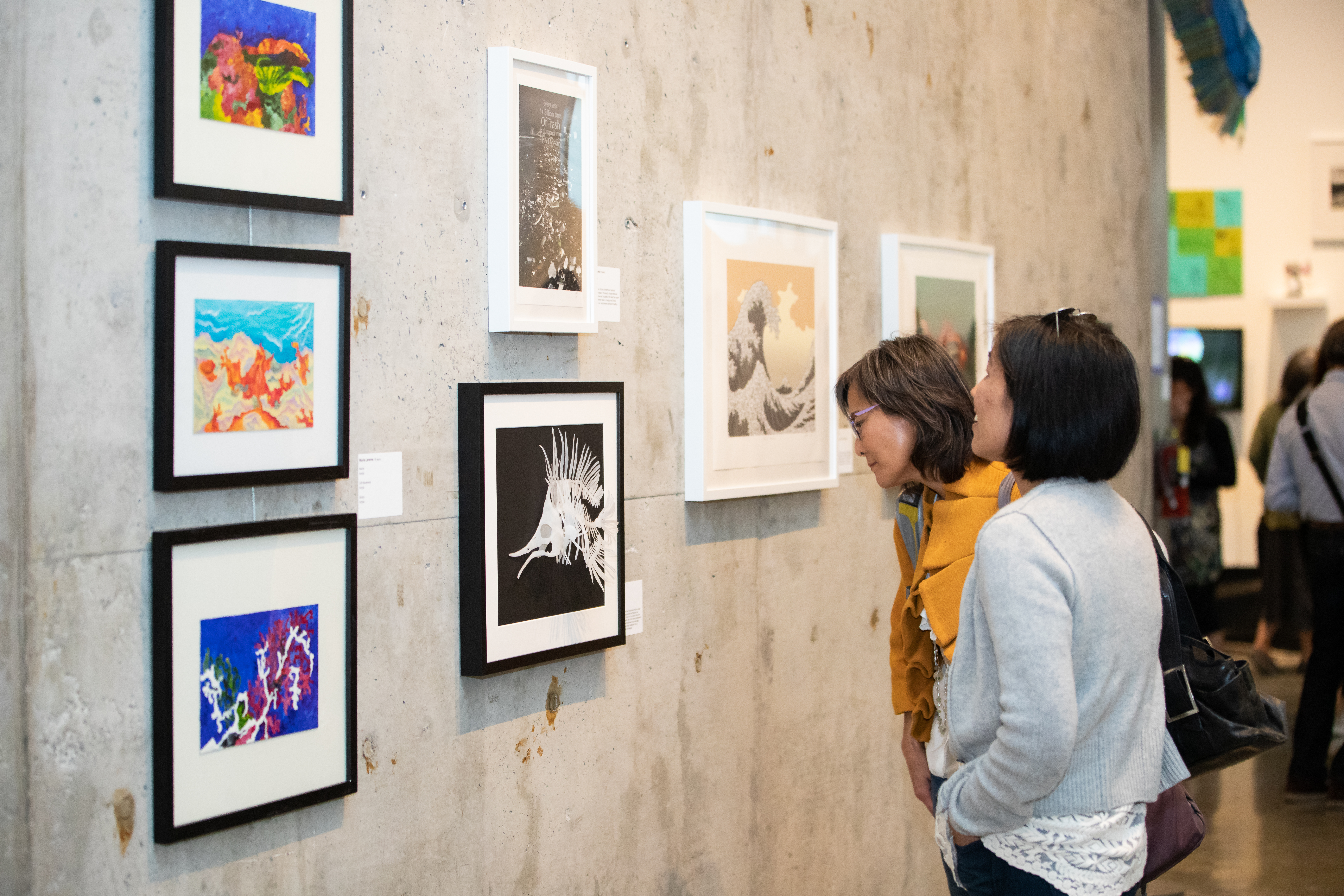
Installation decisions such as artwork layouts and placement largely depend on the exhibition space and the artworks to be displayed. As with printed exhibition materials, each gallery or curator can have different stylistic preferences when it comes to installation choices. The key to a polished exhibition is to establish consistent standards that work for your space and the art.
For example, an exhibition should have an established eye level to which the middle of all works are aligned. This creates visual uniformity throughout the exhibition. Brower Center exhibitions are typically installed with an eye level of 60”. The placement of artwork labels should also be standardized whenever possible. It is best practice to place them at a consistent height and equally spaced from the artwork. Brower Center installers usually space labels about ¾ of an inch to 2 inches from the edge of the artwork for smaller pieces.
Sometimes, installation treatment cannot be kept consistent across the whole exhibition due to irregularly sized artworks, varied wall dimensions, lighting differences, etc. In these cases, you should strive to implement uniform installation spacing and treatment for each wall or grouping of works. For example, on one wall you may hang labels next to the bottom right corner of each artwork. If the lighting on an adjacent wall makes it difficult to read labels placed on the right side of the artworks, you may decide to place all the labels on that wall on the left side instead. Thoughtfully considering what works best in your space and implementing consistent installation standards whenever possible will help you produce a professional, museum-quality exhibition for your students.